
FLOW Monitor
Cloud App
UI and Brand Refresh
I was tasked with developing a new system language for the Cloud components of a microsurgery device and monitor pairing, starting with the icon. I then used this language as the basis in developing the UI for a dark version of the phone app.
* This project, which I did with my Spring 2021 co-op at Kaleidoscope Innovation, is not officially on the market, so I can't discuss all of the details publicly, but I would be more than happy to elaborate in person :)
ICON DEVELOPMENT
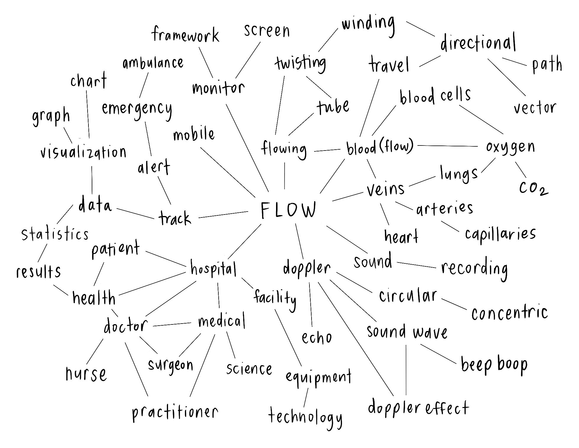
Word Association Map

Icon Sketches

Black and White Digital Ideation

ICON REFINEMENT
I continued refining black and white iterations of the most successful ideation from my sketches. Once I landed on a design that satisfactorily communicated the feel of flowing and the recording of sound, I incorporated brand colors into what would become the final version of the icon.
LOADING ANIMATION: AN EXPANSION!

When I was initially designing this icon as a second-year design student and first-time co-op, I had a clear vision of a loading animation in my mind, but I lacked the experience in After Effects to make it come to fruition.
The following semester, once I’d learned the basics of animation in my Kinetic Communication class, I decided to revisit the idea I had during my co-op. It was so satisfying to finally be able to turn this vision into a reality!
