
It’s My Write: Three Nobel Laureates
Exhibition Poster Series
Three experimental typography posters with common visual language persuading viewers to attend a series of museum exhibitions about the lives and work of three groundbreaking winners of the Nobel Prize in Literature.
GROUNDBREAKING VOICES

RABINDRANATH TAGORE (1861–1941), the Bengali poet, was the first non-European to win the Nobel Prize in Literature in 1913.
GABRIEL GARCÍA MÁRQUEZ (1927–2014), the Colombian novelist, was the first Colombian to win the Nobel Prize in Literature in 1982.
TONI MORRISON (1931–2019), the Pulitzer Prize-winning American novelist, was the first Black woman of any nationality to win the Nobel Prize in Literature in 1993.
The Western gaze has long undervalued indigenous and folk art, not only in literature but in all areas of visual and functional art. These rigid standards largely fail to acknowledge the artistic, historical, and cultural value of the ways victims of colonialism have always been imagining and depicting their lives.
The recognition of each of these authors by the Nobel Academy represented a step forward, however small, in the white Western world’s acknowledgment of the rich cultural tapestries that have always existed beyond the dominant cultural “grid.”
VISUAL INSPIRATION
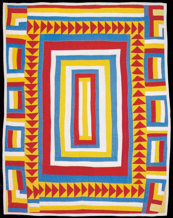
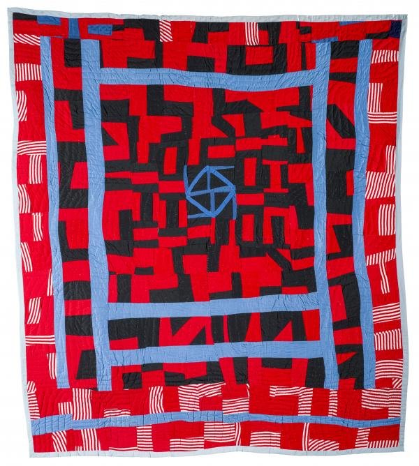
I was particularly interested in the rich history of African American quiltmaking, which incorporates dynamic, asymmetrical, and improvisational compositions, as well as unexpected combinations of pattern and color. In doing so, these quiltmakers eschew the rigid standards of traditional European quilts in favor of a story and visual language of their own making.
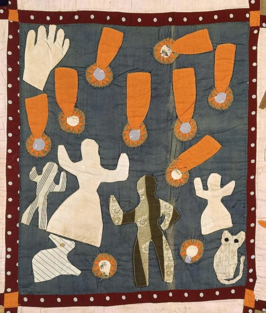
Harriet Powers, Panel of "Pictorial Quilt," 1895
Arbie Williams, "Medallion," 1987
Sherry Byrd, "Roman Stripe Variations," 1989
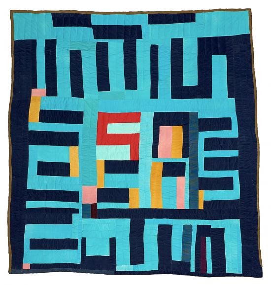
Mary Lee Bendolph, "Blocks and Strips," 2003
EARLY TYPOGRAPHIC EXPERIMENTS

DEVELOPING “A NEW GRID”
I wanted to reflect the authors’ unique contributions to literature by “breaking” the traditional Swiss typographic grid. I selected quotes from each author that celebrated the culture that allowed them to see beyond the “grid” imposed by Western society.
I created experimental patchwork typography from these quotes by cutting and rearranging text using a unique angle or altered proportions. The secondary text follows the distinct grid established in each composition, with important event and biographical information lining up horizontally to generate a sense of continuity across the series.


